On a recent visit to an In-House Users Group meeting at a Pharmaceutical company, I presented a 1/2 day seminar on creating Clinical Graphs using SG Procedures. Polling the audience for their experience with these procedures indicated that many SAS users are not familiar with these new ways to create graphs.
So, just as we release the 5th maintenance to SAS 9.4, I am motivated to continue with this thread of the Getting Started series with its 8th installment. The audience is the user who is new to the SG procedures. Experienced users may also find some useful nuggets of information here.
With SAS 9.3, we first saw the advent of the HIGHLOW plot statement in the SG Procedures and GTL. This statement is very versatile and feature rich. While it is very useful by itself, it is also a great tool to create many complex graphs. In the 7th installment of Getting Started, I discussed the features of the Vertical HighLow plot statement. Here, we will discuss the features of the "Horizontal" version of the same statement.
To create a horizontal High Low plot in the SGPLOT procedure, you will use the following syntax:
highlow y=<variable> low=<num-variable> high=<num-variable> / type=line | bar <options>;
Type = line is the default, so this option is only needed when you want the "Bar" type segments. This statement plots horizontal line or bar segments from low to high value along the x-axis at the specified location on the y-axis. Let us see some examples, and build towards a popular clinical graph called the "Swimmer" plot. I have concocted some data as shown below.
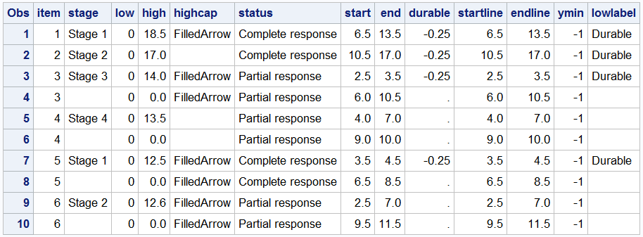
The column "Item" is used to position the segments vertically, the segments are drawn along the x-axis using the various variables such as Low, High, or StartLine, EndLine, and so on. Some additional columns such as "HighCap" and "LowLabel" are used with some special features of the statement as will become clear shortly.
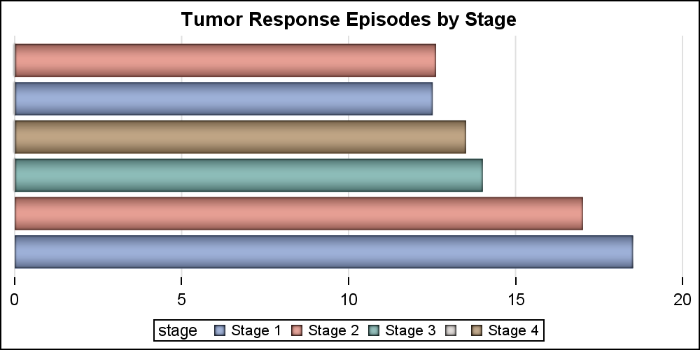
Let us start with the simple High Low Bar plot. The code and graph are shown below. Note, the "Low" variable has all values as zero, so the all bar segments start at zero, making this appear like a horizontal bar chart.
title 'Tumor Response Episodes by Stage'; proc sgplot data=swimmer noborder; highlow y=item low=low high=high / type=bar group=stage dataskin=pressed; yaxis display=none; xaxis display=(nolabel noline) grid; run; |
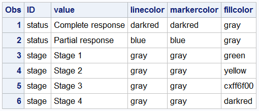
The above graph uses the default colors for the 4 stage values used as the classifier. We can use a Discrete Attributes Map to assign colors by value. We can also display an arrowhead where needed as shown below. The "attrmap" data set is provided on the procedure statement. An attr map data set can contain multiple attribute map sets, each used with one classification such as Stage and Status here. This grouping is done using the "ID" variable in the data set, and the appropriate value is provided with the "Attrid" option in each statement in the procedure.
title 'Tumor Response Episodes by Stage'; proc sgplot data=swimmer noborder dattrmap=attrmap; highlow y=item low=low high=high / type=bar group=stage highcap=highcap dataskin=pressed attrid=stage transparency=0.3; yaxis display=none; xaxis display=(nolabel noline) grid; run; |
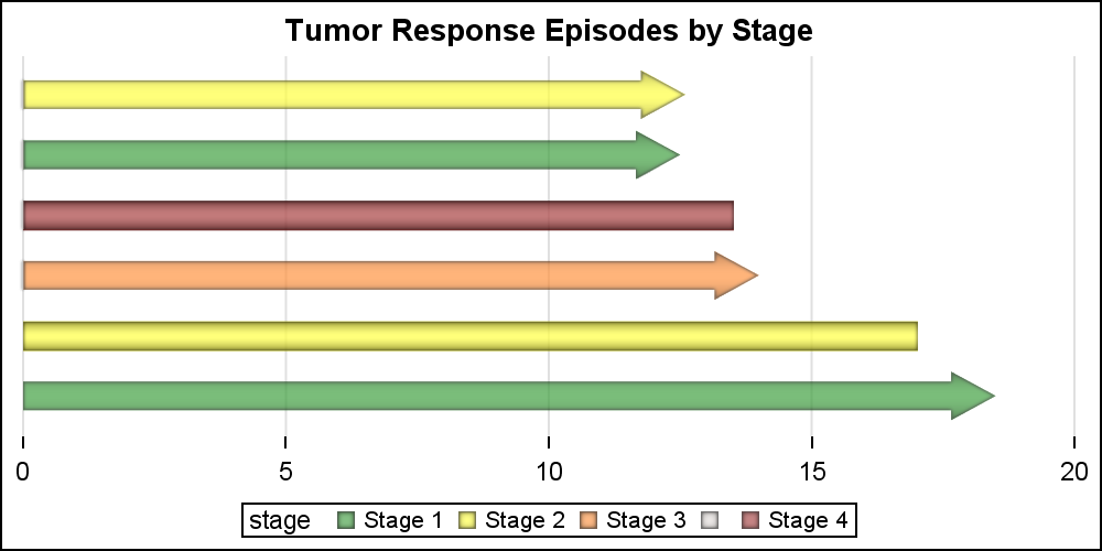
For the graph above, we have created a data set "attrmap" that defines the colors for use by two statements in the procedure. These are grouped by the ID value of Stage and Status. The data set is shown below. I had to define my own "Orange" as CXff6f00, but you could find a named color for that. We have also use HIGHCAP=highcap to draw the arrowheads where appropriate.
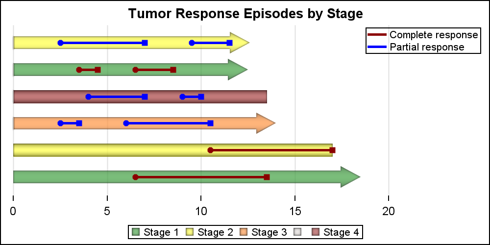
Now, we can use the HighLow plot with Type=Line (default) to overlay response episode line segments on the overall treatment bars. The 2nd HIGHLOW plot does that . We have also added Scatter plot layers to place markers at the start and end of each episode. A legend for the Stage values is shown at the bottom, and another legend for the Status values is shown in the upper right of the plot. I have set OFFSETMAX=0.2 on the XAXIS statement to provide some space for the inner legend.
title 'Tumor Response Episodes by Stage'; proc sgplot data=swimmer noborder dattrmap=attrmap; highlow y=item low=low high=high / type=bar group=stage highcap=highcap dataskin=pressed attrid=stage name='stage' transparency=0.3; highlow y=item low=startline high=endline / group=status attrid=status lineattrs=(thickness=3 pattern=solid) name='status'; scatter y=item x=start / group=status markerattrs=(symbol=circlefilled) attrid=status name='start'; scatter y=item x=end / group=status markerattrs=(symbol=squarefilled) attrid=status name='stop'; yaxis display=none; xaxis display=(nolabel noline) grid offsetmax=0.2; keylegend 'stage'; keylegend 'status' / location=inside position=topright across=1 linelength=20; run; |
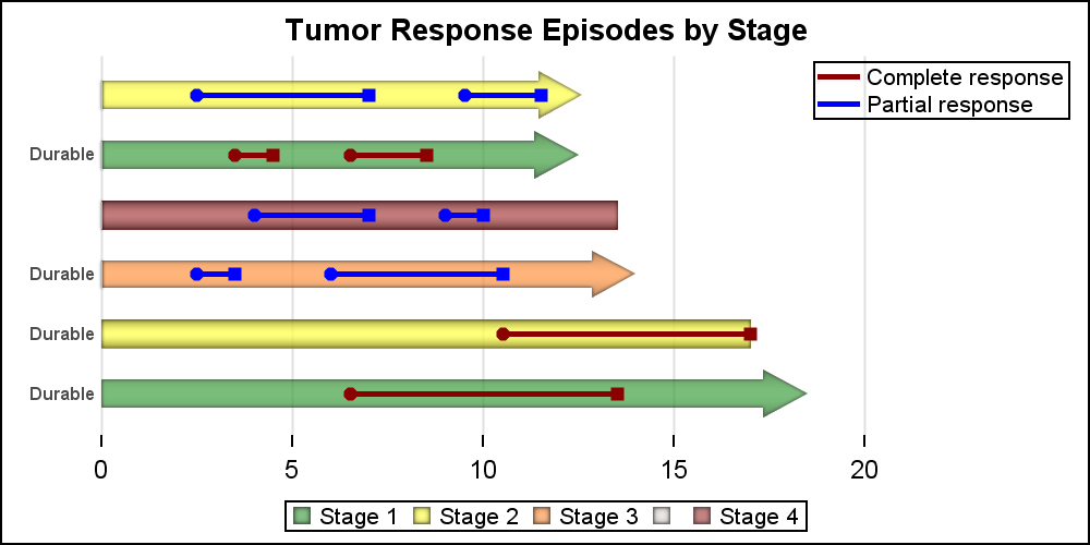
Finally, we can use the labelling features of the HighLow plot to mark the subjects who are considered to be "Durable" responsers as per the appropriate criteria. We use the LOWLABEL=lowlabel to display the annotation on the left end of each bar segment. See the linked full program below.
Full SGPLOT code: HighLow_Y